Anne Vis Art & Design

Finding the inner voice through art

Join me on a journey to find what really makes my art uniquely mine. Finding my own style and expression. Previously I explored primitive art and neurographic line art and today I am arriving at a basic issue that can’t be ignored:

Part 3:
The use of color as a personal art style

CONTENT:

Abstract Art

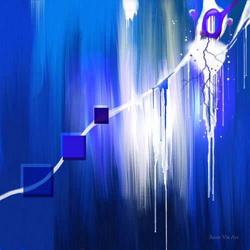
I actually started with an abstract painting. (Naively thinking that might be the easiest way to start) Of course I immediately ran into all sorts of trouble đŸ™‚Â 
I came across this video on YouTube called “Top 3 Mistakes Making Your Abstract Look Messy” (uhm, yes)
If you’re into abstract art, you may want to check it out. It brings up all sorts of topics related to abstract art and extending into other forms of art as well.
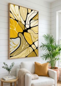
On the color wheel this abstract would be made with adjacent colors.

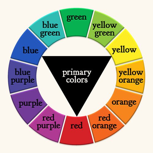
The basics: the color wheel?

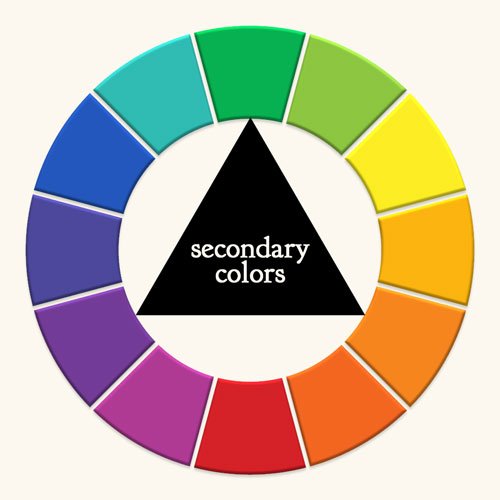
THE COLOR WHEEL
is where all articles about color start.
In case you haven’t noticed yet: I never had any formal art training and am struggling to even follow basic tutorials.
But do we really need a color wheel?
I worked the other way round: first creating a painting and afterward checking out what I had done in term of the “wheels”.
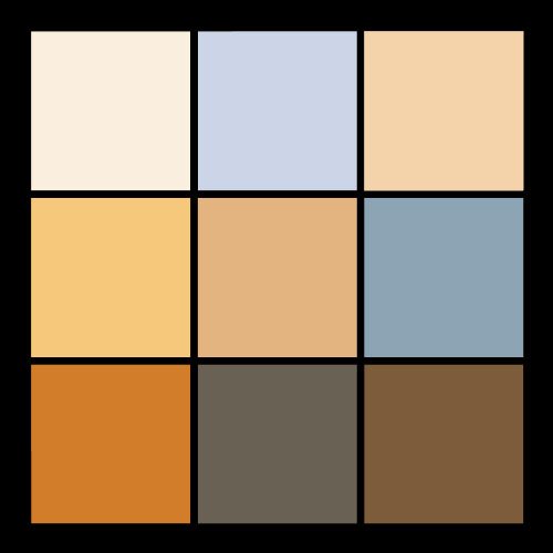
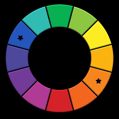
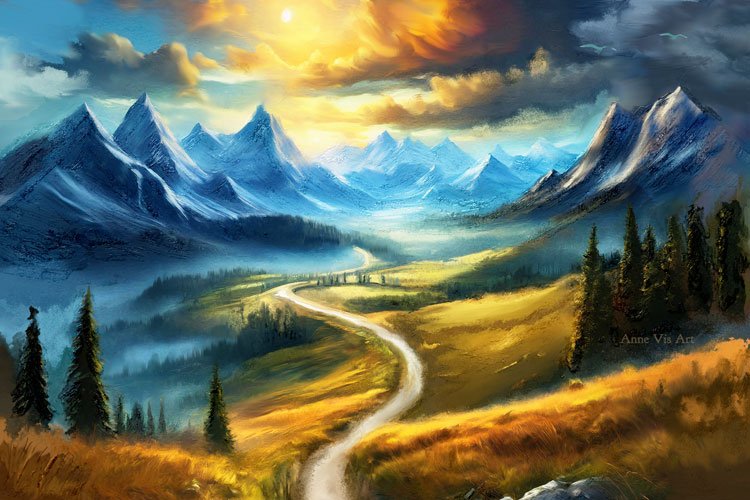
So to the right is the painting and below are color wheel considerations.

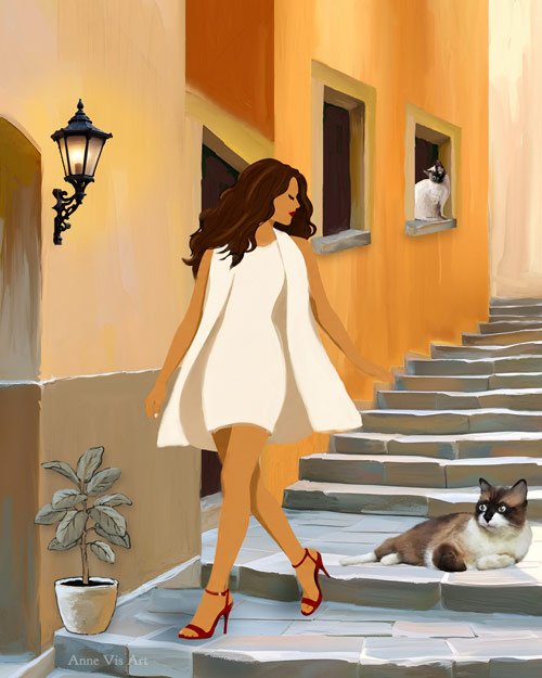
Although I did not “plan” the color palette, it turned out to be a choice of opposing colors on the wheel, which is considered to create harmony.
I actually spend many days to create this as I ran into all sorts of other challenges (as you can see), which will be covered in next topics.

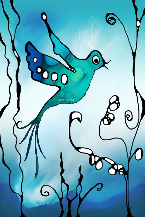
Something blue ...

Color palettes with blue, green and yellow create a fresh and lively atmosphere. In these examples I am building on what was discovered previously in primitive art and neurographic art

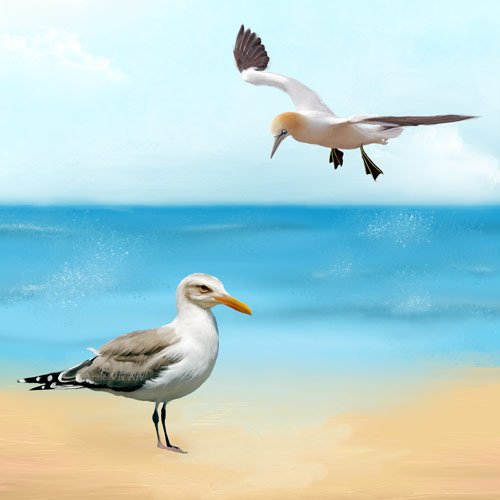
Beach please!

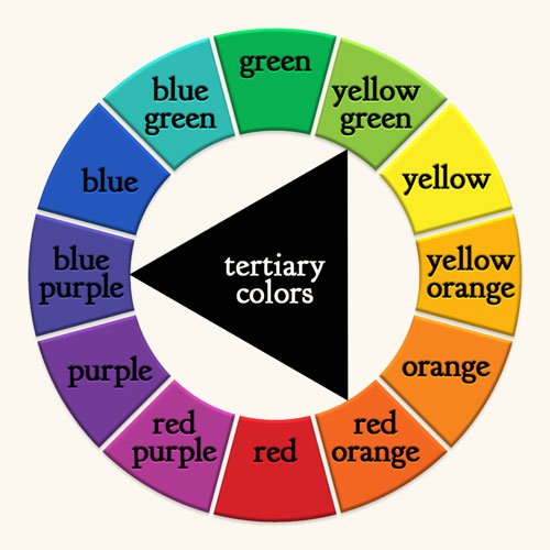
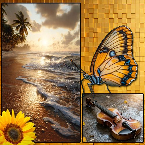
With a color choice of mainly orange-yellow and blue-green, this palette does not follow traditional preferences. The colors are not exactly opposite, but I consider them to be enough “family” to approach opposite. These colors are both TERTIARY COLORS. I tried to make a simple fantasy beach with a minimal color palette. Just listen to the waves crashing on the shore and smell the salty air … peace!

The expert's secret

I have to share this video about color, it is just so awesome!

Off the charts ...

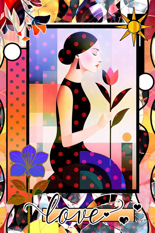
I really like creating collages in Photoshop. It’s fun and relaxing. In this experiment I used as many colors as you can imagine đŸ™‚

A woman smelling a flower, in retro style and with several adjustments from the original stock images.
Smelling the flowers is always a good idea!
And could it be that “retro” is part of what is leading to what could be my “unique style”?
Maybe a signature style is not so unique?

Conclusion

To conclude: Using color to find my personal art style has shown me my color preferences. It might be interesting to try to use a combination of yellow-green and red-purple more as they seem to be under represented in what I generally make. Though to me this color combo is what comes more to mind with imagery like a witch, chemical lab or futuristic sci-fi scenes.  Other than that, the color wheel does not add much for me.
This study brought up a whole bunch of other topics that deserve attention. So: to be continued!